Friday 8 April 2011

Project Evaluation

Overall, I am satisfied with the outcomes I have produced for the Mutton Quad brief. I think my links between typography & the theme of the restaurant is fairly strong, although I admit I could have done a couple of things in addition to emphasize these links even more, perhaps having the history of the Trajan Pro typeface & it's links to Trajans Column & Trajan himself written on items within the restaurant. I also wanted to create something visual to decorate the interior of the restaurant, but couldn't really think of anything typographic to feature, other than what was already on my menus, stationery etc. If I had designed something for the interior, it would have been very imagery-driven, similar to a wall mural, and therefore would have gained me no extra points as this is a Typographically-based brief. In terms of the imagery I opted to use, I am happy with how I decided to feature Latin text from the foot of Trajans Column, as I think this shows even more links to my chosen typeface, as it is set in a very similar way. Regarding final outcomes, I feel I could have done something more in addition to the outcomes shown. I would have liked to have created some form of Wine label, although due to the amount of times I decided to change my idea for this brief, I was left with little time to create such items. While my time was not necessarily badly managed, as I was constantly developing ideas, it would have been better to have come up with an idea early on & pursued that throughout, although I think I benefited in the long run as my previous ideas were not particularly typographically-driven & showed no links between the restaurant theme & typography. In summary, I am happy with my project outcome. I think the links to typography are visible, although I do wish looking back, that I had put more emphasis on type as a theme.

Thursday 7 April 2011

Final Outcomes: Drinks Menu

Here is my final outcome for my Drinks menu. This follows a similar theme & appearance to my food menu, although I have reduced the size of the menu itself, mainly due to this appearing to be the norm in most restaurants. I have also central aligned the type on the menu itself, as this also seems to be done in a lot of restaurants. The appearance of the drinks menu is virtually identical to the food menu, but since these are both double-sided menus, and one is smaller than the other, it shouldn't be too hard to tell the two apart in the restaurant.

Final Outcomes: Food Menu

Here is my final outcome for the Trajans food menu. As seen on my business card for the restaurant, imagery used on the menu & it's cover is very central to the Roman theme, and to reinforce this, the imagery is taken from the sculptures around Trajans Column in Rome, Italy. On the cover, I have decided to place a lightened strip behind the Trajans logo so that it does not become hidden amongst the very fussy imagery, with the menu itself, I have toned down the levels of the imagery in the background so that the copy becomes more central to the design. The typeface "Trajan Pro" has been used throughout this design to show the links between the restaurant & it's themes, and typography. I have also added Latin text from the foot of Trajans Column to the menu cover, as the typeface it is set in is virtually identical to the "Trajan Pro" typeface I have used throughout my items for the restaurant.

Final Outcomes: Company Stationery

Here is the first of my final outcomes for the restaurant, "Trajans." I have kept the business card very similar to the menus you would find inside the restaurant itself, in order to maintain a brand identity. I'm fairly confident about the balance of imagery & type on the business card, being named after the Roman Emperor, I wanted Trajan's head to be fairly prominent on the business card, but not so much so that it too focus away from the type, which is what this project is all about. With the letterhead, I have strayed away from the very Roman sculpture theme of the menus & business card, as you wouldn't really have a full colour image like the ones on the menus & business card. Not only do I think it would have looked unprofessional, but it would also have been slightly difficult to read the letter. Instead, I opted to use a watermark on the page, of the Trajan helmet. As said in previous blog posts, this marque is iconic enough to stand on it's own without typography to accompany it, and also adds something to the letterhead without it looking to crowded or untidy.

Wednesday 6 April 2011

Done & Dusted.

Ok, so I've finally finished my outcomes for the ISTD brief. I'm fairly confident with how these turned out, I'm just hoping the links are strong enough to be recognised. I'll begin posting my outcomes on my blog over the next couple of days as it's deadline day on Friday, and I have my D&AD work to finish off first before I make the final additions to my blog, but up to now I have completed company stationery & food/drink menus for the restaurant, all with a corporate image, which I'm pretty pleased with overall.

Friday 1 April 2011

What Else?

Just so I know what I'm doing for the upcoming week (and this is for personal use more than anything else), I've jotted down a list of items I need to apply my logo to & design things for. 
  • Company Stationery
  • Food/Drink Menus
  • Napkins
  • Uniforms
  • Cutlery(?)
  • Wine Labels

Developing Menu Concepts

Getting familiar with my menu concepts, I've come up with this rough idea. It's not finished yet, still needs things cleaning up & adding to it, but you get the basic idea. I've featured the logo on the front of the menu in a dark shade of grey, as opposed to bold black, just to add a bit of subtlety to the logo. I think this works much better. The typeface, Trajan Pro is used throughout the menu to reinforce the Roman/Latin theme. Imagery/Colour wise, I've opted for a very stoney, reddish-brown colour to reflect the stone that Trajan's Column is made from, with subtle images of the sculptures from the column included. I'm pretty happy with what I've come up with for the menu so far, and am looking forward to developing this idea further. I'll be using a similar theme on other items in the restaurant, such as Wine labels, Drinks menus etc. I'm on the fence about creating a simple back-to-back menu, and create a seperate drinks menu, or to do them all as one as a multi-page menu. Leaning towards the idea of a back-to-back menu, as I'd like to create a seperate drinks menu, thus widening my design opportunities.

Utensils

To once again get a feel for how the logo is going to look on restaurant items, I've placed the logo on a napkin this time. I'm really, really pleased with how this looks. I think it looks really professional (not to blow my own trumpet) and the logo itself flows really nicely, the marque doesn't look out of place & I'm finally happy with the way everything is positioned. Even though the logo itself is solid black, I think it works nicely on the napkin in an almost lighter grey colour. Not entirely sure if this will happen when printed, but it certainly works. I've finally found my restaurant logo!

In Situ.

In order to get a feel of how the logos look when in situation, and also to help me decide which looks better, I've quickly added the Trajans logo to a T-Shirt, which would eventually become a uniform. Initially, I have decided to add the logo using a solid black marque & in all honesty, I'm starting to feel better about this design. I think it works. It looks more like a marque & in my opinion has the potential to look recognisable as a stand alone marque as well. I'm going to place my logos in other situations, which will hopefully finalise my decision, although at the moment, it seems like I've chosen my design. These last few posts have focused pretty heavily on the marque aspect of the logo, so now I think it's time to get back to the typography!

Developing the Logo

I've narrowed my logo designs down to four concepts. Since I was having problems deciding on a style & position for the marque, I've placed my four final designs on a sheet in hopes of getting a bit of insight into which one looks better. Personally, the first & second logos look most appealing to me, I wasn't too keen on the solid black helmet at first, but in this position I think it looks ok, flipped horizontally it almost finishes off the logo, but on the other hand, I really like the stenciled marque which uses a simple outline. I've lost a bit of enthusiasm for the last two designs, as I don't think the marque looks as effective above the type. I'm leaning towards keeping it at the side as it appears to flow better as part of the logo. I'm confident about position, just not about style. I'm really finding it hard to pick between solid black & outline. Solid black looks good as it is a more prominent marque, but also looks a little too bold, while the outline marque looks cleaner & more polished, yet perhaps too simple & not eye catching enough to have as a marque. Things can go either way now.

Second Attempt

Here is my second attempt at positioning the marque aside my type. This time I've opted to place it at the side of the text, almost as an emphatic full stop. I've also given it a more outlined look, as opposed to being solid black, as I think solid black looked a little too bold. I like what I've done to change the marque, but I think I will probably go with my initial idea & place the marque above the type, as it looks more prominent, however I must admit that using the marque at the side of the type makes the helmet look more like part of the logo. Regardless, I still think it works better above the type.

Mythical & Hoplite Noogies

Just out of curiosity, I decided to have a look at "Dingbat" typefaces to see what kind of imagery pops up to do with Roman warriors, emperors & such. While browsing the "Ancient Dingbats" on dafont.com, I came across this particular typeface, entitled "Mythical & Hoplite Noogies." Some of these dingbats are pretty cool looking, and would work well as a marque. Whether or not I actually use one of these, or just take inspiration from them, I'm not sure, but I'm really liking the vector style shapes of all these images, they look very elegant & regal & really nicely reflect the whole "Roman Empire" theme.

Positioning the Helmet... Ooh Err!

Here is my first version of the logo with the added Spartan Helmet marque. I'm currently playing around with the positioning of the marque alongside the type & my first idea was to use it as a prominent image above the type, but also (as cliche as it is) to use it as almost a dot on top of the "J." I quite like this version, but I'll continue to reposition it until I decide on a final position. Whether or not the helmet needs to be reduced in size also remains to be seen, as I want the type & the marque to be equal in terms of what catches the eye first.

Spicing up my Logo

Going back to my logo design, I'm a little underwhelmed with what I have come up with so far. Although the theme is typographical, I think a marque will make the logo look even more recognisable & effective. The imagery I had in mind was something similar to what is pictured here, the famous Spartan helmet. A simple vector design will work effectively in my opinion as the shape of the helmet is instantly recognisable. Combined with the "Trajan" typeface already established in my logo, I think this will make for an effective looking marque that can be applied to menus, uniforms, cups & other items.

Monday 28 March 2011

Background Imagery

While the main focus of this brief is typography, I do of course need imagery to emphasize & back up my theme. I have created this piece of imagery to place on material I create for the Restaurant, such as menus etc. I think this works well as it nicely reflects & portrays the Roman feel, while not completely straying away from what you'd consider to be a traditional Italian restaurant. Once all my typography is in place, I'm hoping this will serve as "the plate on which my type will be served." (Round of applause please.) I haven't decided yet whether or not to use this imagery on other material such as wine labels etc, but I definitley want to maintain this look as I think it perfectly portrays my theme. I've even incorporated the Latin text that is found at the foot of Trajan's Column, just to reinforce the typography, even within an image.

Naming the Restaurant... Again!

With only a week left, I'm happy to have FINALLY settled on a theme & name for my restaurant. Using the Trajan Pro typeface & Roman Emperor Trajan himself as a theme, I've named the restaurant, simply "Trajans." Originally, I was going to call the restaurant "Trajans Column" with the sub-title of "Italian Restaurant" however, this was a bit of a mouthful, so I've cut it down to just "Trajans Italian Restaurant." I think this works better, mainly because it is more simplified, but also because naming it after the famous monument may have taken away the focus on typography & focused more heavily on history. Narrowing it down to Trajans links the two together, without emphasis on one over the other. For my menus, I have a very clear image in my head of what I want to produce. Rather than the multiple page menu I was going with while designing for "The Green Room", I've decided to go with a much simpler double-sided menu. The cover of which will focus the prominent "Trajans" logo, along with Roman imagery & the Latin wording found at the foot of Trajans Column itself, establishing the links to history as well as typography.

Friday 25 March 2011

An Unconventional Italian Restaurant

When someone uses the term "Italian Restaurant", everyone is quick to form an image in their head of the "traditional" look of an Italian Restaurant. I really want to stray away from that with my design, since it's theme is so elegant & regal. Pictured is the sort of interior I had in mind for the restaurant, with sculptures, balconies & such. This is the look that should be really reflected in my menus & other material to perceive the restaurant theme.

A Change in Direction...

,
Ok, so once again, the direction of my restaurant theme has changed. While going through the design process, I noticed how heavily I'd used the typeface "Trajan Pro" throughout my logo & menu, so to further the connection between my restaurant & typography, I've decided to pursue this as a theme. While researching the typeface itself, I discovered something quite interesting; Trajan's Column. At the foot of this monument in Rome, Italy, is what appears to be Latin text, which is set in a typeface identical to Trajan Pro. This is my theme. The restaurant will be named after the monument, obviously serving Italian food & the identity of the restaurant will reflect the Roman look. While changing my idea at such a late stage is probably not so wise, I'm fairly confident with this concept & feel as though I can successfully pull it off.

Tuesday 15 March 2011

Making changes

After showing some of my previous menu designs to my tutors, they advised me to change the way I am showcasing my food imagery, suggesting that the fade I had added previously took something away from the image, making it look almost as though it was "under water" & causing it to look less appetising as well. Many consider food photography to be somewhat of an art, so the images I choose to use should be displayed in a way that makes the food look it's best. I still want to use food imagery, but I think using a flat image makes it look a little too prominent on the page & I want it to look more subtle, so I have opted to get rid of the gradient I had used before, and instead have chosen to pursue a full page image, made ever so slightly transparent so that the image is more subtle & not as prominent. I think this works much better, but it will depend on how I place my typography on the page as to whether or not this approach is more successful.

Choosing a Colour Palette

Pantone 5835U, an example of the colours
I intend to use in my palette.
I'd like the identity of my restaurant to be consistent, with corporate colours used throughout my restaurant logo, menus etc. Firstly, I intend to produce my menu on matte stock, so will be using colours from the Pantone Solid Uncoated range. The colours I used originally captured the general look of what I wanted to pull off, so I will be going for something very similar when choosing my corporate palette. My palette will consist of very light greens, to be used throughout my menu & part of the logo, combined with a medium green to emphasise words & images. I will show these in my later development stages.

Tuesday 8 March 2011

Julie Powell

Using IMDB as my source for good "Julie & Julia" quotes, I decided to do a simple Google search to see what I could find. I was able to find a site called goodreads.com, which appears to have an absolute ton of quotes from Julie Powell, the person who took inspiration from famous cook, Julia Child. It appears these quotes are from her book, rather than the film itself, which doesn't really matter I suppose, especially since the quotes found on this page are a damn sight better than the ones I found on the Internet Movie Database, particularly the one stating how Julie "Loves her husband, like a Pig loves shit." That's a cracker that one!  It will be interesting to see which of these quotes can be explored & portrayed in an effective, typographic manner.
You can view the list of these quotes, by clicking the "goodreads.com" link in the above paragraph.

"You are the Butter..."

Going back to what I said about using quotes from iconic movies/plays, or at least those that look at food, I decided to look up quotes from the film "Julie & Julia" starring Meryl Streep. Unfortunately, none of the quotes were particularly awe inspiring, but I liked the sound of the one shown above, and I think this could be one that can be widely explored typographically.

And I Quote...

If I am to pursue the use of movie/theatre quotes in my restaurant interior, I must ensure they are quotes that are either iconic in themselves, or from iconic movies or plays etc. There are a number of ways I can portray these quotes on my restaurant interior, but deciding on a final design may be difficult. This part of the project may require a little in depth research, which shouldn't be too difficult. The Internet Movie Database (www.imdb.com) has areas where it is possible to find iconic quotes from movies, and due to the fact I am basing this project on a restaurant, it seemed only logical that my first search would be "Breakfast at Tiffanys." Scrolling through the quotes, I found one made by Audrey Hepburn's character, Holly Golightly, stating "I've got to do something about the way I look. I mean a girl just can't go to Sing Sing with a green face." This one stood out to me particularly due to the use of the word "green" in the sentence, which may sound completely idiotic, but you can see what I was thinking when reading the quote on the web. I was thinking of perhaps looking for quotes from movies or plays that are centred around food, such as "Julie & Julia" or "Ratatouille." As I said, this will need some work & some research...

Restaurant Interiors

Above is the type of restaurant theme I would like "The Green
Room" to have, a very classy yet casual interior theme.
Now I'm on track with my menus, I can begin looking at how the interior of my restaurant is going to look. One theme I was considering using inside the restaurant, reverts back to my very first development stages of this project, where I was going to put the use of inspirational quotes into effect on the walls of my restaurant. This would have tied in with the laid back, chilled out approach I wanted my restaurant to have, where friends would casually drop by for a Panini & a drink. The use of these quotes would give customers something to look at & think about, perhaps even discuss while enjoying their meal, and the quotes would be very much focused around friendship & memories etc, something along those lines. This may still work as the restaurant interior, but may be more difficult to link to the restaurant name & the healthy theme of the restaurant itself. Another theme I have looked at & discussed, is by tying in the name "Green Room" to the interior of the restaurant by placing inspirational movie or theatre quotes on the walls. This keeps with the theme I explained previously, but also links to the name of the restaurant. This could even mean that customers are seated in a "green room" before being called onto the stage, aka the restaurant itself. Whichever direction I take this in, I am intent on keeping the wall quotes in my design, as this will also help convey the typographic element of the restaurant, as opposed to just having different typefaces on the menu.

Monday 7 March 2011

Alternate Dessert Menu

Just for kicks, I've been playing around with different layout & imagery for my menu. Using the dessert menu as an example, I've placed the menu header in a coloured box to highlight which section of the menu you're looking at, as well as replacing the image that was originally a fruit salad with an image of Carrot Cake. I've also centre-aligned the type on the page & changed the typefaces for the menu items. I have kept the names of the dishes in the Trajan Pro typeface I used previously, and replaced the descriptions with the Savoye LET typeface. This creates contrast between the dish title & description. The use of Savoye LET also ties into the concept I had of using different typefaces to represent different foods. In this instance, Savoye LET has been used throughout the dessert menu as this is probably easier & looks more professional than picking & choosing different typefaces for each & every dish. I think this works well as the Trajan Pro type retains some consistency with the logo, while the Savoye LET typeface captures the lightness & elegance of desserts as a whole.

Menu Part 2

Here is the second part of my Green Room Menu. Once again, all the type on the page is uniformed, as this is basically just to give a feel for the layout of my menu itself. I've retained the greenery of my first part of the menu, but have used different tones to distinguish menu sections, in this case starters & mains. I've also tried to use appealing imagery, corresponding with items available on the menu, and also keeping within the healthy element of the restaurant. As said in my previous entry, I will probably give each menu item it's own unique typeface in order to set each item apart & have a typographic representative for each food item. Unfortunately, there are no steaks or heavy dishes available on the menu, so picking typefaces for dishes that are similar will be a little more difficult, but not completely impossible.

Initialising a Menu

With my overall concept in mind for the theme of my restaurant, I have quickly come up with a rough menu. This design looks at the front of the menu & the back page, focusing on desserts. The items on the menu are not necessarily the ones I will include in my final design, but what I have so far gives an impression of what to expect from my design. Just to get a rough idea of how everything would look, I have used the same typeface for the menu as I have for the logo (Trajan Pro). By the time I finalise this design, each item on the menu will probably be set in a different typeface to better represent the food itself, for example using very light typefaces for dishes such as salads & heavier ones for dessert dishes like chocolate cake etc. As I said, nothing is set in stone so far, but my main aim with these progress posts is so I know the direction I am going in.

Houston, we have a logo!

So, after a labourous couple of weeks deciding on names, themes & logos, I've finally come up with a logo & name for my restaurant that I am happy with. The use of the name "Green Room" gives audiences the basic idea of what is on offer inside the restaurant & the inclusion of a knife & fork adds to the visual aspect of the logo itself. They have been put in place because I thought the O's in Room could be used as plates... Cheesy & cliche maybe, but I am happy with it. Green colours are used throughout the logo, although the word Green itself has been set in a much darker tone to put the emphasis on the "Greenness" of the restaurant itself, which will be a healthy eating restaurant, although I intend to maintain the laid back, chilled out theme that all my initial development stages focused so heavily on. This will keep in theme with my restaurant name as Green Rooms are often seen as a place to relax, so I don't have to worry about any discrepancies between name & theme. When designing my menus & restaurant interior, the items on the menu will be set in typefaces that represent the foods themselves, as opposed to being linked by name. This will mean the chosen typeface will more than likely be a very light, elegant typeface to reflect the food served on the menu.

Typographic Representation

I've decided to go with the name "Green Room" for my restaurant, which is more of a link to food than a shared name, which I think will work better as it is more subtle. In an attempt to approach the items on the menu with a similar approach to the one I assumed VetteLetters were going with, using typefaces that look like the food, for example "Leek" is set in a very tall, green typeface. "Red Onion" is set in dark red, using a very poignant typeface to represent the sharpness in the smell & flavour of Onions etc. The visual I have created above is very rushed, but I think could be pulled off if done right. This sort of thing could also work for the typography I aim to place on the restaurant walls, perhaps as a sort of "Chef Special" written on the wall as opposed to an inspirational message. This also means I'd have to look towards a different approach to the restaurant itself, as it is starting to take a more organic, almost "healthy option" approach, which doesn't necessarily have to throw the laid back, relaxed approach out of the window, but definitley takes the direction of the restaurant down a different avenue.

Cliche...

There is of course the cliche approach of using food itself as type. This is not necessarily an approach I want to take to answer this brief, but I feel as though it shouldn't be ignored completely, due to it being so commonly used. I think there are times when this outcome can look good, I just want to try something different due to it being so cliche. If all else fails... There's always Alphabetti Spaghetti!

VetteLetters

Just via a simple Google search, I stumbled across this website, VetteLetters, which appears to link food with type. Perfect. Unfortunately, a lot of the text on the website is unreadable due to the site being based in the Netherlands, although from first impressions, it would appear the typefaces featured on the site, are more of a typographic representation of the foods as opposed to being linked via a shared name. For example, typefaces used with potatoes are large & chunky, typefaces used for spaghetti are very fine flowing. It's a visually interesting website, and it serves up some decent inspiration. As said in my previous blog entry, my restaurant does not necessarily need to share a food-typeface name, it could do what this website does & typographically represent foods with fitting typefaces.

Links to Food

Looking at the brief, and judging by talks with tutors, it would seem more logical to come up with a name & identity for my restaurant that is linked to food, typographically. This could mean anything from finding a name of a typeface that is the same as the name of a food (the first one that sprung to mind was Savoy Cabbage = Savoye LET) or could be a play on words i.e Grill Sans, as opposed to Gill Sans (Thanks Roland!) This will definitley prove more difficult than choosing a generic name & identity, but could and should, look more visually appealing. My restaurant name does not necessarily need to be directly linked to food, using the same name, it could be more subtle, for example linking "green" vegetables, to a name such as "the green room."

Development of Ideas

Here is my very first (rough) idea for a logo for my restaurant, using the "Lounge" name. Personally, I think this logo looks rather swarve & sophisticated, but I don't think it really captures the look I am going for. It is a very uptight looking logo, being all in capitals I think it looks rather in-your-face & doesn't really portray the laid back, relaxed atmosphere that I would want the restaurant itself to give off, perhaps using a logo all in lower case would work better, although I am confident that using the Lounge as the name of my restaurant will put across the message of a chilled out restaurant.

Friday 4 March 2011

A Lesson in Typography

Here's an interesting video on Typography, that I was shown during my first lecture at Hallam University. The video is entitled "A Lesson in Typography" and basically covers the basics of type & it's various structures & forms. I found this video very interesting, as throughout the course of the video, various typefaces, layouts & type structures are shown, which could serve as potential inspiration for this project. I particularly liked how all these typefaces were formed during the video, as they began to form the sort of layouts & structures that I would like my wall type inside my restaurant to take.

Friday 11 February 2011

Decisions, Decisions...

Now that I've been working on this project for a couple of weeks, I really need to be entering the design stage, which I have been doing to an extent, but I haven't been saving any of my ideas as I can't decide on a name for my restaurant & personally, I think this needs to be done first in order to gain an identity for my restaurant & give me (no pun intended), food for thought in terms of how the interior of the restaurant, menus etc are going to look. Since I aim to make this restaurant a place for friends to go for casual lunch, an equally casual name should be given. So far I've narrowed it down to two names, and they are "Just Friends" & "The Lounge", both accompanied by the tagline "the casual meeting place". I have brainstormed a few design ideas for both of these names & they both work well, and I am leaning more towards calling my restaurant "The Lounge". It sounds more adult, mature & sounds like a relaxed, comfortable place for people to meet up & dine.
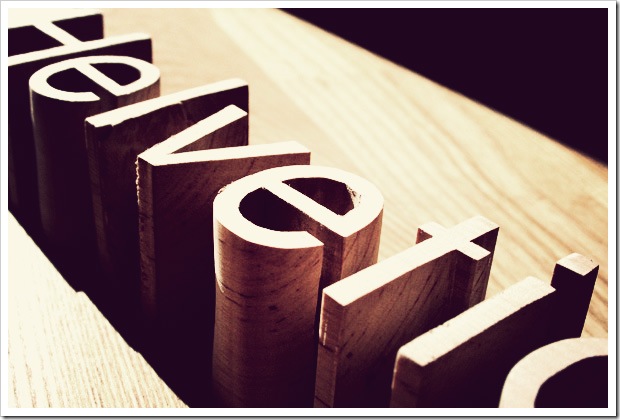
3D Typography

I just fancied having a browse through various forms of typography on Google, and one of the forms that struck me was 3D type. Carrying on from a previous blog entry, chronicling another designers approach to this brief, I think 3D typo would work well, if strategically placed within the restaurant, either as a piece of furniture or just for ornamental/decoration purposes. As a typographically themed restaurant, I think both of these methods will work equally as well.

Friday 4 February 2011

Choosing a name & theme

Now I feel as though I am going along the right track with the "Mutton Quad" brief, in terms of how to approach my design, I must first decide on a name & theme for my restaurant. Since my approach to the design will probably be something along the lines of strategically placing typographic quotes & phrases on the walls of the restaurant, My first idea was to put my restaurant across as a warm, friendly & welcoming restaurant, that is more casual than upmarket, very similar to the Ha Ha Bar. My idea is to have this restaurant as a casual meeting place, for friends to meet up for a quick bite, or if they are going out for the night, to pop by for an evening meal, hopefully putting across more of a walk-in, sit-down atmosphere where you don't have to go through the process of booking a table. To focus in on this type of atmosphere, the quotes running up & across the walls would be nice, witty comments about friendship & meeting people, to fully enforce the casualness of the restaurant itself. The name selection is going to be the hardest part of this process, as I want to come up with something that is short, yet memorable & to the point, but can also be displayed nicely typographically & keeps within the theme of the "friendship" aspect of the restaurant.

Tuesday 1 February 2011

PhantomCoconut

After Googling "Mutton Quad" out of curiosity, to see what came up to give me some inspiration, I came across someone else who appears to be blogging about this particular project. Scrolling through their blog, I found a post regarding several rough concepts & visuals, the most interesting being his or her experimentation with 3D type & using typography as objects within the restaurant. The most interesting idea that I noticed was the use of letters, words & typefaces as such things as tables, barstools etc (the stools in particular striking me as a very clever idea.) All of "Phantomcoconut's" blog entries showing the development of an idea are very thorough & in-depth & the visuals are particularly interesting & well thought out. To visit the blog & have a look round for yourself, click HERE!

Anamorphic Type

While on the subject of design.org & placing type on walls, I stumbled across this very cool article on the aforementioned website, which is all about anamorphic type. This is unbelievably well executed. The project was completed by Joseph Egan & Hunter Thomson, students at Chelsea College of Art & Design & is entitled, "It's more than just Print" & experiments with the use of type & flat, geometric shapes & surfaces. Very cool.
You can read the article, and watch the amazing point of view video, showing this project in full, by clicking HERE.

Mutton Quad

I've managed to decide on a brief to pursue for the ISTD project, and that is "Mutton Quad"... No, I don't understand the title but the project sounds interesting. Basically the overall theme is to base a restaurant around typography, which sounds easy enough. I've had a few discussions with my tutors & have come to the conclusion that the best way to approach this brief is to do something similar to the "Yo! Sushi" wall mural, having typography, phrases, quotes etc placed on the wall, on the menus, floors & so on.

Saturday 29 January 2011

ISTD 2011

Here's my first post for the ISTD (International Society of Typographic Designers) brief.
I haven't actually decided on a brief to focus on for this project, once again, none of them have really jumped off the page at me & most of them I have struggled to get my head around, it's almost as though someone's collected all the words from a dictionary & scattered them across the page. Needless to say I'll probably have a brief chosen by this week, but regardless of the brief I choose, I have something else I want to share. Whilst doing my routine Facebook news feed check, a post emerged from a group I "liked" called Design.org, entitled: "Make it Better." noticing the word typography in the description, I decided to click through & find out what this was all about & it happened to be a really cool Typography video, showcasing various typefaces in a kinetic format, showing how type can start off as very simple & basic & completely escalate to wild & wonderful levels, you can check out the video by clicking HERE!