Now that I've been working on this project for a couple of weeks, I really need to be entering the design stage, which I have been doing to an extent, but I haven't been saving any of my ideas as I can't decide on a name for my restaurant & personally, I think this needs to be done first in order to gain an identity for my restaurant & give me (no pun intended), food for thought in terms of how the interior of the restaurant, menus etc are going to look. Since I aim to make this restaurant a place for friends to go for casual lunch, an equally casual name should be given. So far I've narrowed it down to two names, and they are "Just Friends" & "The Lounge", both accompanied by the tagline "the casual meeting place". I have brainstormed a few design ideas for both of these names & they both work well, and I am leaning more towards calling my restaurant "The Lounge". It sounds more adult, mature & sounds like a relaxed, comfortable place for people to meet up & dine.

Friday, 11 February 2011
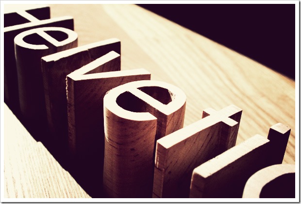
3D Typography
Friday, 4 February 2011
Choosing a name & theme

Tuesday, 1 February 2011
PhantomCoconut
 After Googling "Mutton Quad" out of curiosity, to see what came up to give me some inspiration, I came across someone else who appears to be blogging about this particular project. Scrolling through their blog, I found a post regarding several rough concepts & visuals, the most interesting being his or her experimentation with 3D type & using typography as objects within the restaurant. The most interesting idea that I noticed was the use of letters, words & typefaces as such things as tables, barstools etc (the stools in particular striking me as a very clever idea.) All of "Phantomcoconut's" blog entries showing the development of an idea are very thorough & in-depth & the visuals are particularly interesting & well thought out. To visit the blog & have a look round for yourself, click HERE!
Anamorphic Type

You can read the article, and watch the amazing point of view video, showing this project in full, by clicking HERE.
Mutton Quad

Subscribe to:
Posts (Atom)